IPW
Digital experiences
As part of an expert review during the beta phase, we developed valuable optimization suggestions for the Information Platform Water (IPW) in order to improve the look & feel as well as the user experience and usability. The aim was to create a modern, functional and visually appealing application with a uniform visual design, clear structures and labels as well as intuitive operating concepts.
Services
UX/UI design, prototyping
Client
Offices for the Environment and Water of the Cantons of Bern, Solothurn and Zurich

Modernization of the appearance
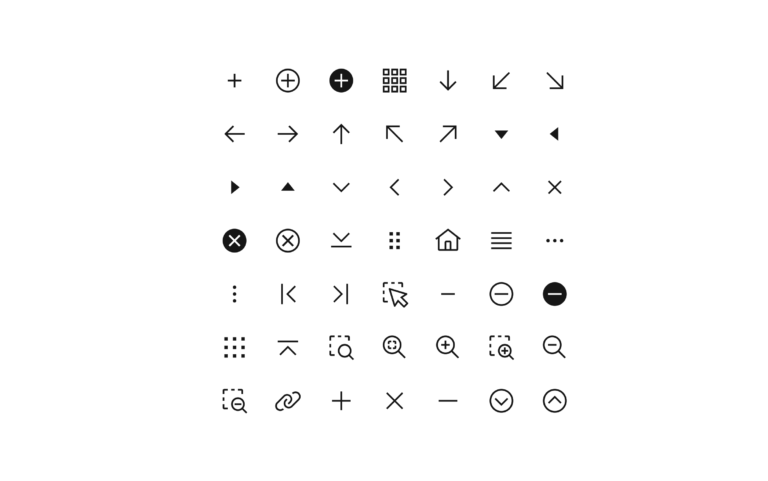
The existing logo was revised and simplified. In addition, a contemporary font optimized for screen applications was selected. A modern WCAG-AA/AAA-compliant color palette was developed to improve the readability of the content and give the application a consistent look and feel. In addition, an extensive open source icon library with clear and comprehensible icons was integrated to further increase user-friendliness.
Navigation and page structure
A logically structured basic layout for use on desktop computers and tablets ensures intuitive navigation. This allows users to quickly access the desired information and find their way around effortlessly.
Dashboard
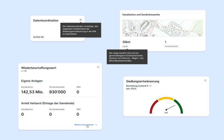
The dashboard offers a compact and clear presentation of the most important information, such as diagrams, key figures and info tiles. This makes relevant data accessible at a glance.

Content structuring
The info tiles follow a uniform layout that clearly structures diagrams, key figures and numerical values and makes the content easy to understand. Contextual information, such as definitions of terms and explanatory notes, supplement the content to match the data displayed. The input screens have been designed to offer improved user guidance: with clear labels, a clear distinction between editable and read-only fields and input validation to ensure data quality.
Plans
The map navigation and toolbar have been optimized to enable quick switching between the available maps. Infrastructure objects are clearly displayed using map pins, while an integrated filter function supports targeted views and a better overview.
File uploads
A clear, step-by-step user guide has been developed for file uploads, making the entire process intuitive and user-friendly. This ensures easy handling and minimizes potential errors during the upload.

The results achieved in the design sprint are now being gradually integrated into the platform. By optimizing the defined focal points, the user-friendliness of the IPW platform has been significantly improved. The platform now boasts a modern, uniform design, an intuitive operating concept and a clear structure. Users benefit from increased efficiency and a significantly improved overall user experience.


