The Living Circle
 Concept + Strategy
 Product + space
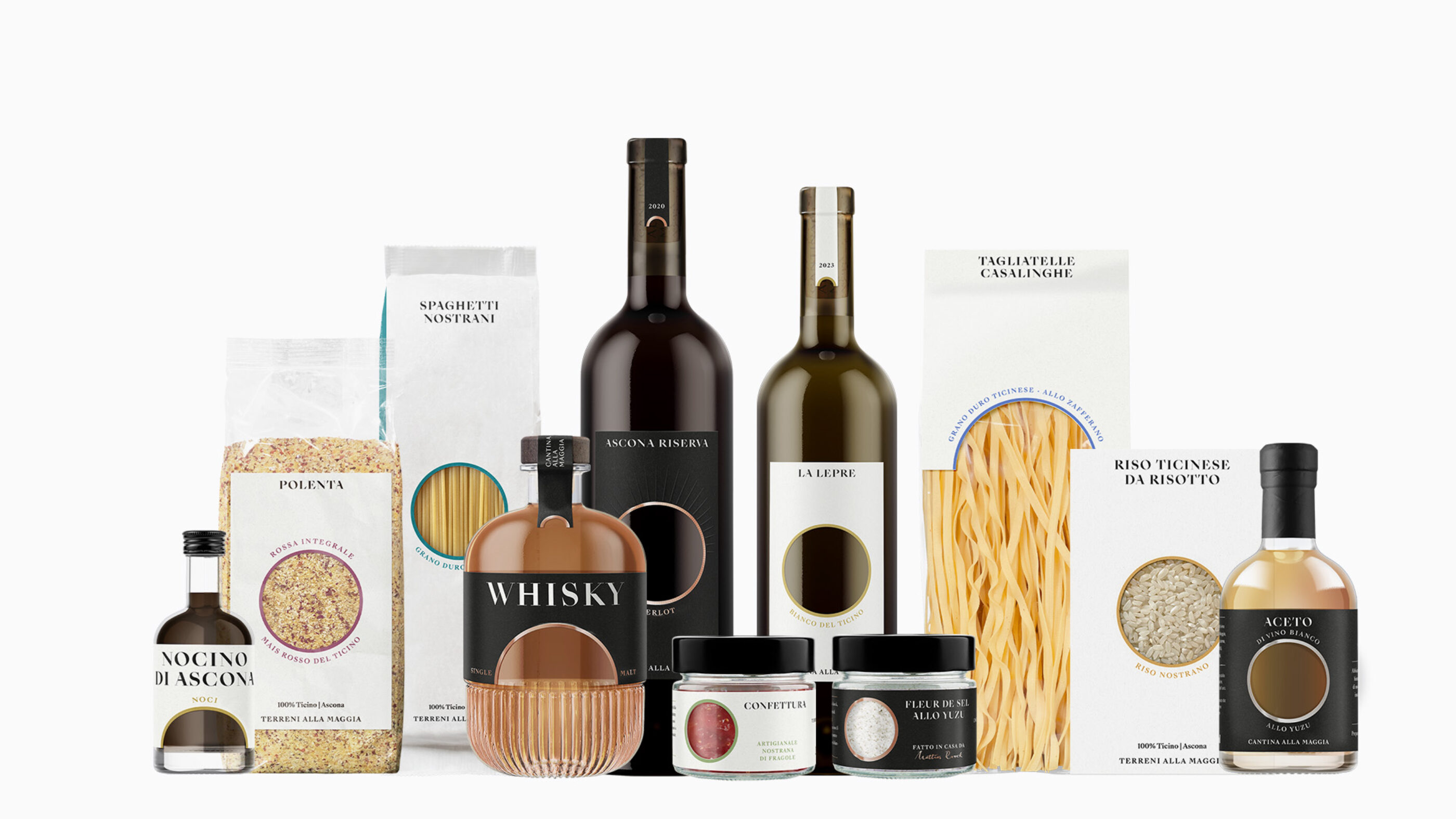
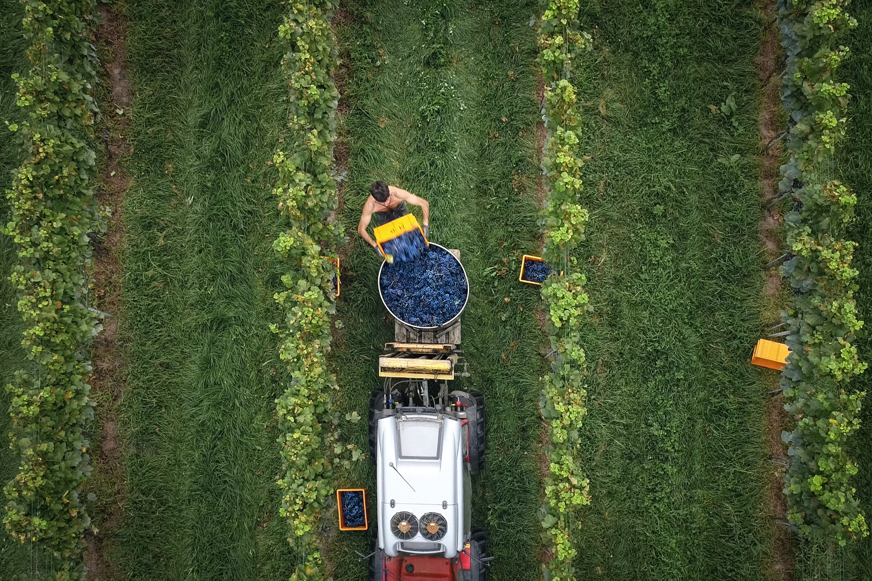
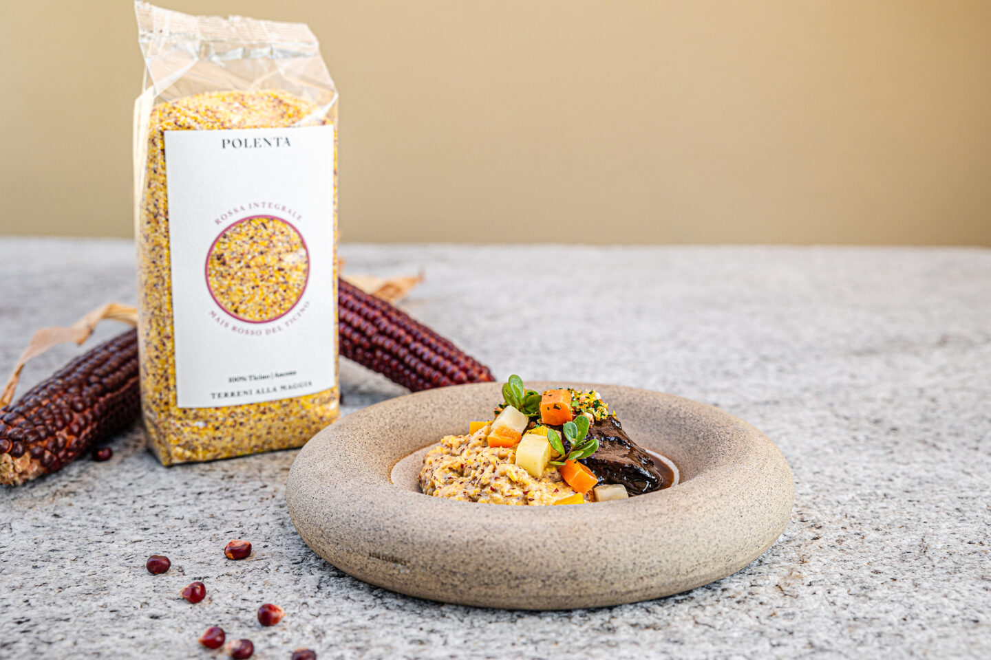
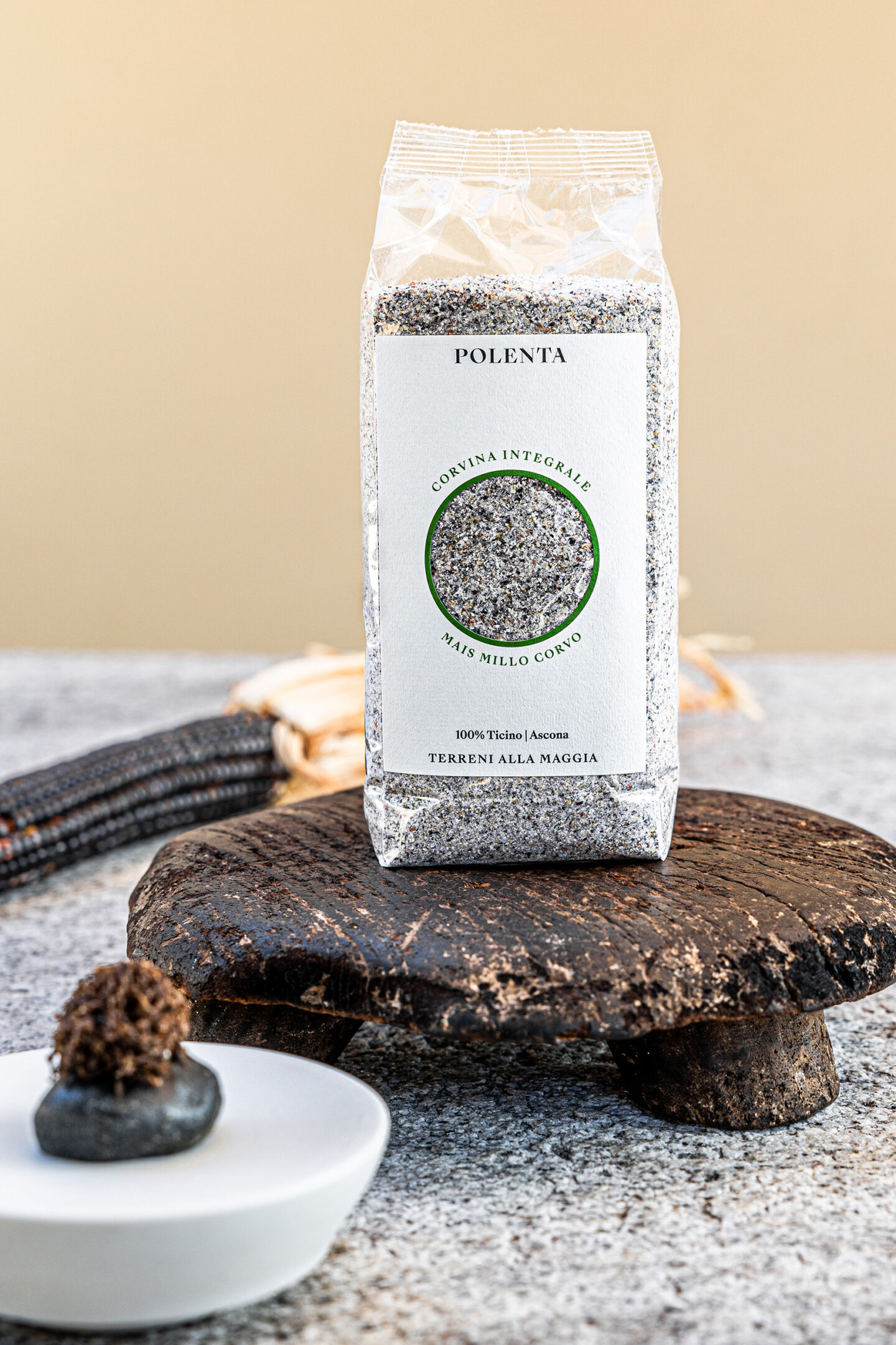
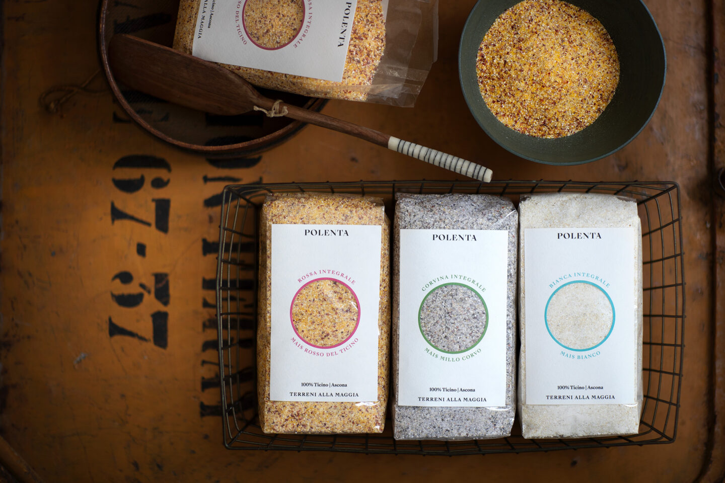
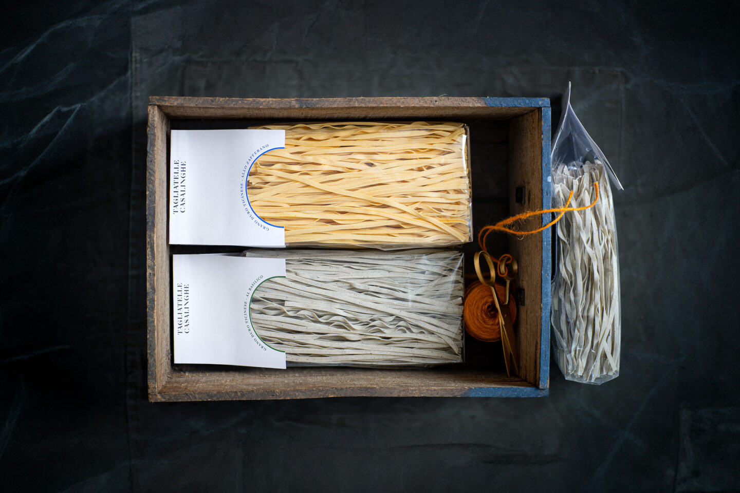
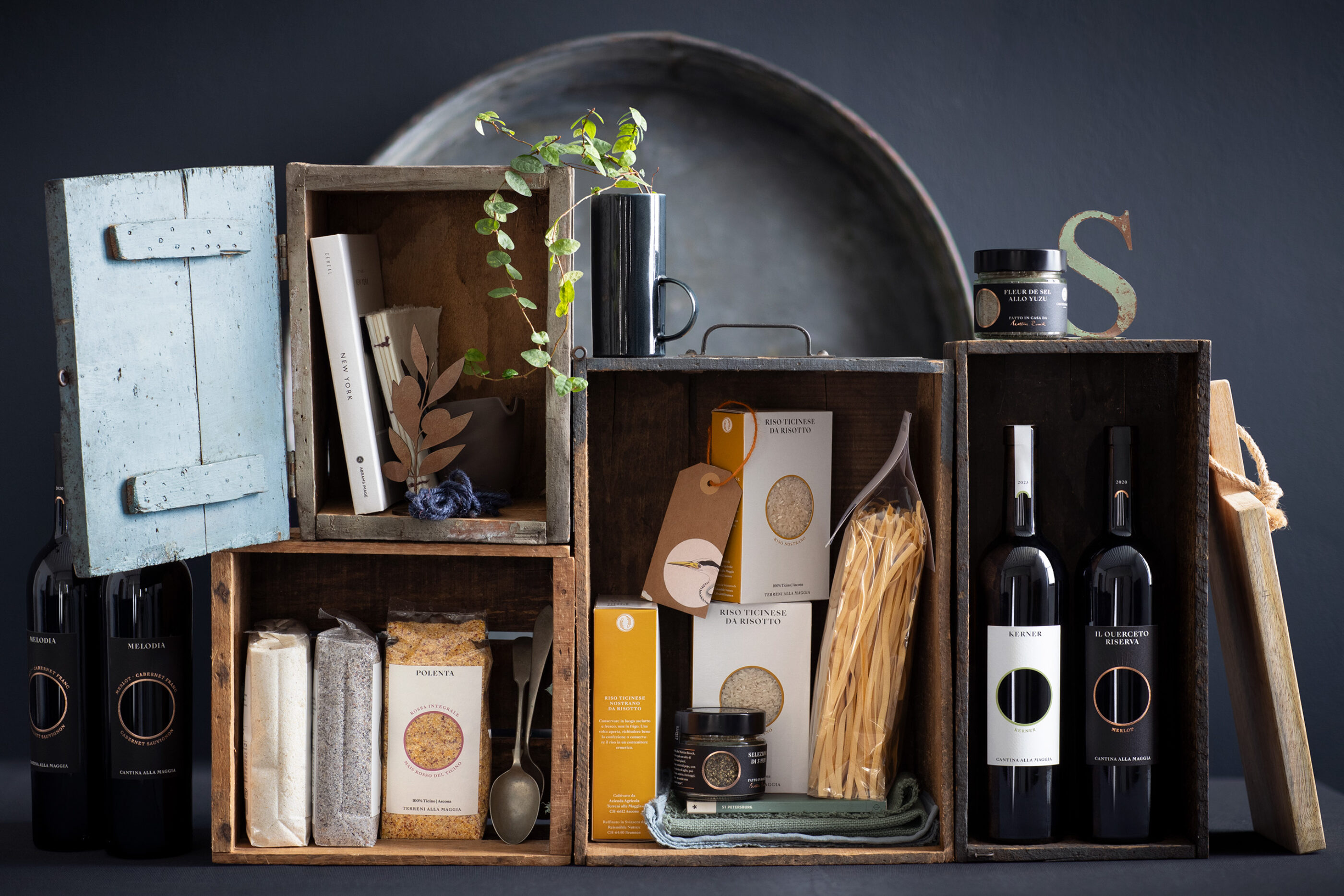
Terreni alla Maggia in Ascona has been synonymous with high-quality, natural agricultural products since 1930. To meet the growing demands of a modern brand experience, the company underwent a comprehensive rebranding.
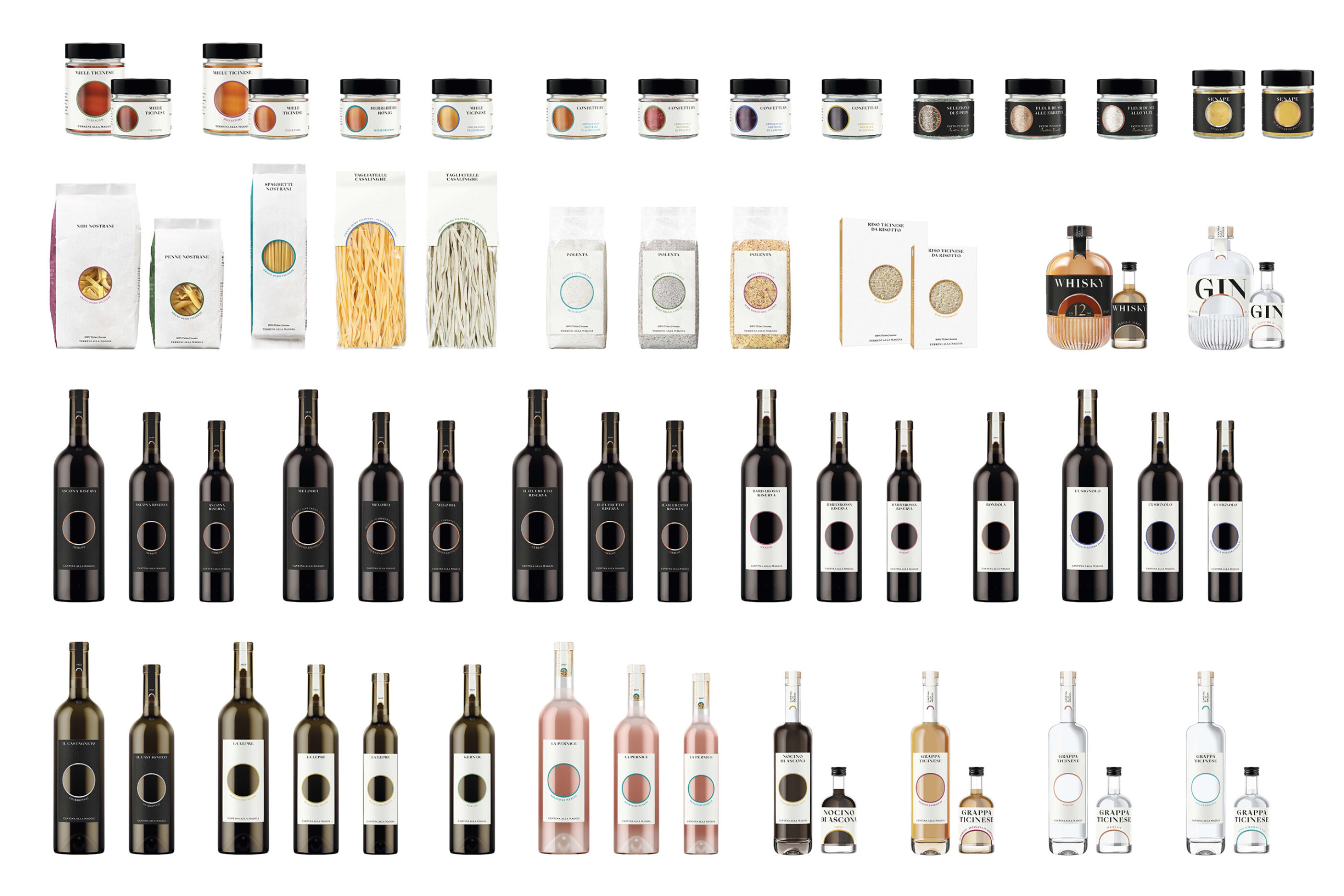
The aim was to create a contemporary, holistic design that embodies the core of the brand - luxury fed by nature. The new look offers a flexible and scalable branding strategy that stylishly integrates future product innovations and consistently develops the brand further.
Services
Research, Concept, Branding, Package Design
Client
The Living Circle
www.thelivingcircle.ch
Initial situation
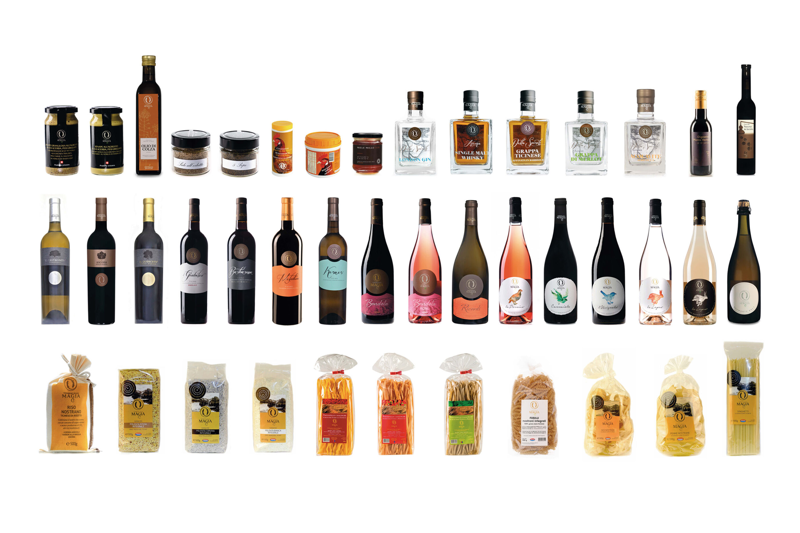
Rebranding
Concept phase
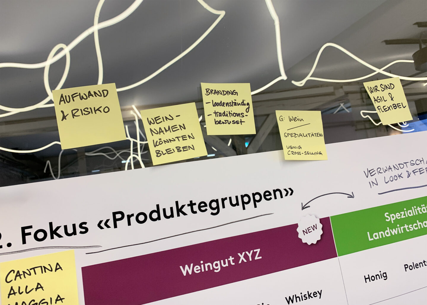
In a series of workshops, the product range was analyzed in detail, strategic approaches redefined and a clear market segmentation developed. All products were repositioned in a targeted manner and the branding was revised in order to create a consistent and future-oriented brand portfolio.

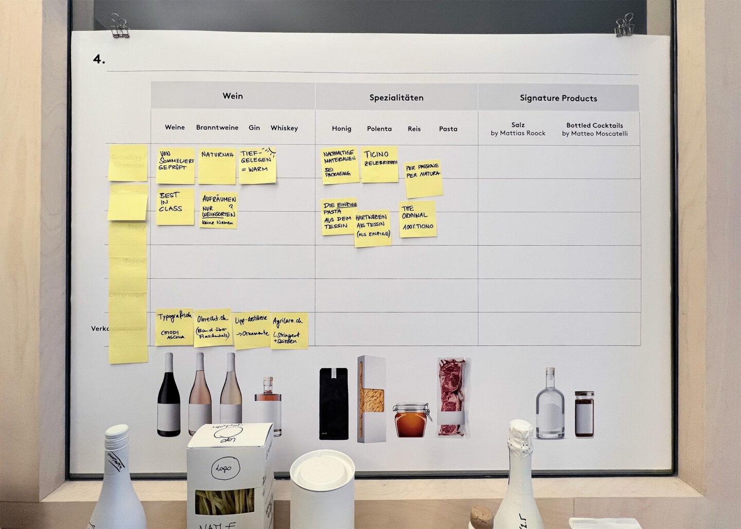
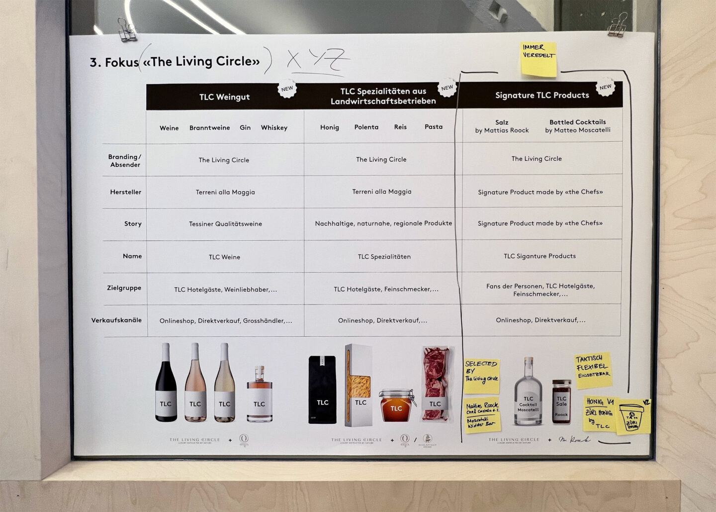

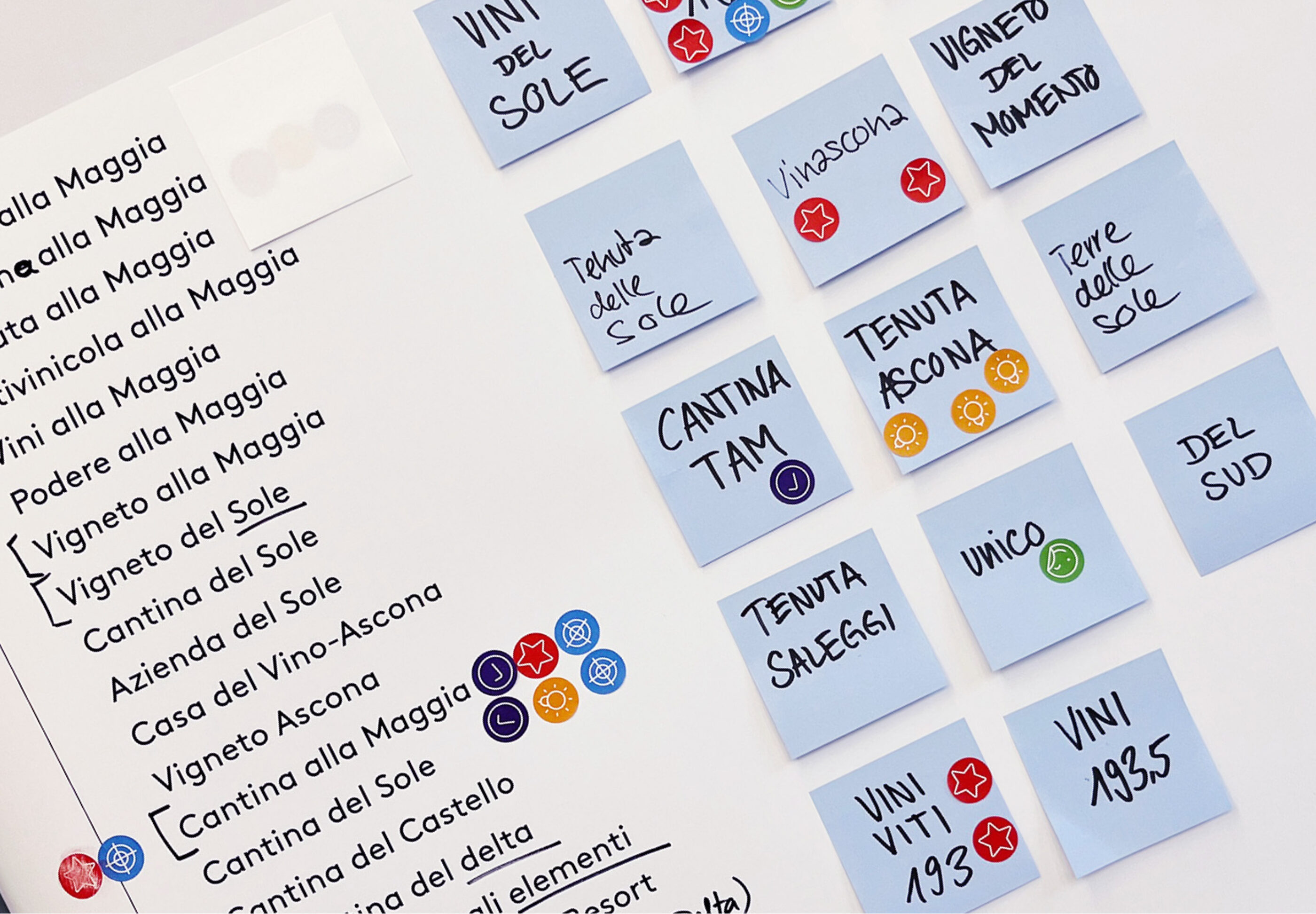
Cantina alla Maggia
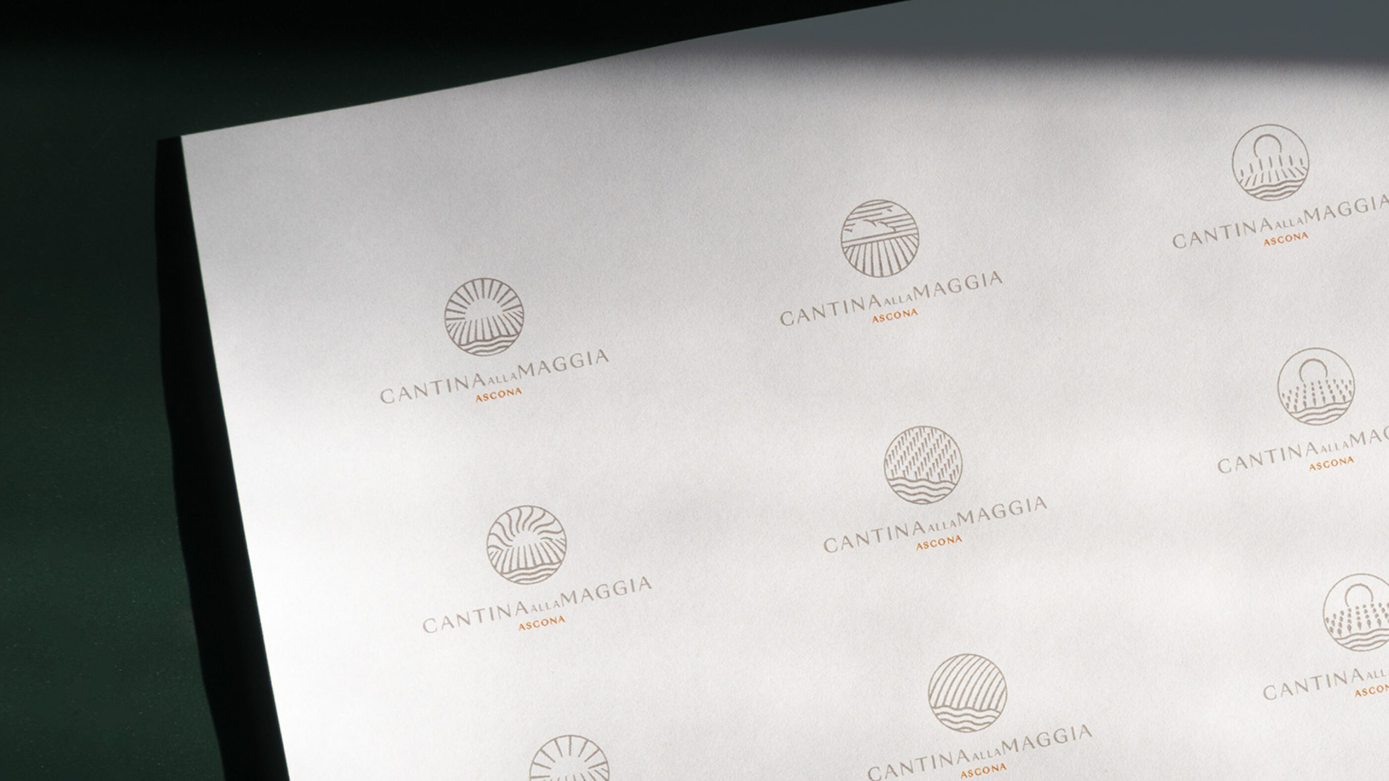
As part of the project, the new Cantina alla Maggia brand was developed for the winery to create a clear strategic differentiation from the agricultural specialties.
At the same time, the corporate design was given a comprehensive upgrade. The logo universe underwent a modern visual refresh to present the brand in a contemporary and future-proof way.

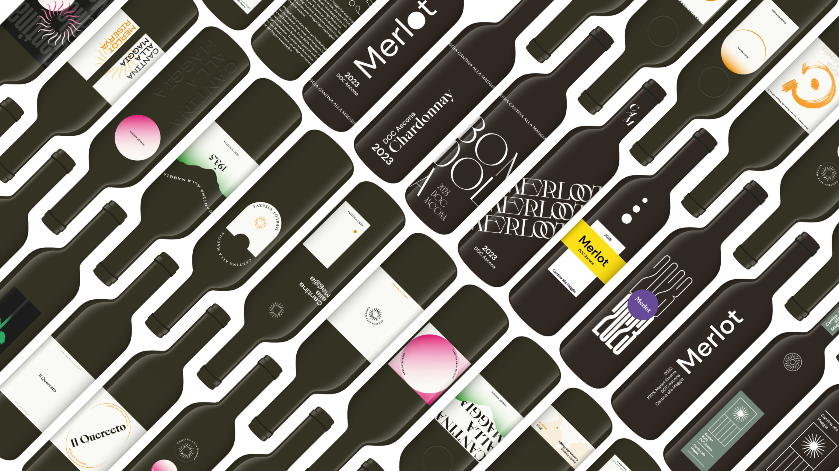
Iterative development
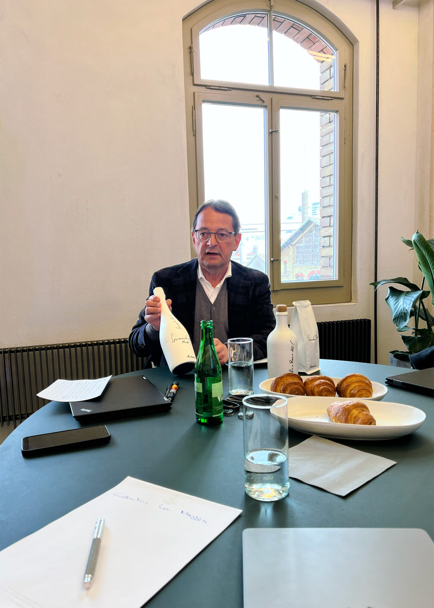
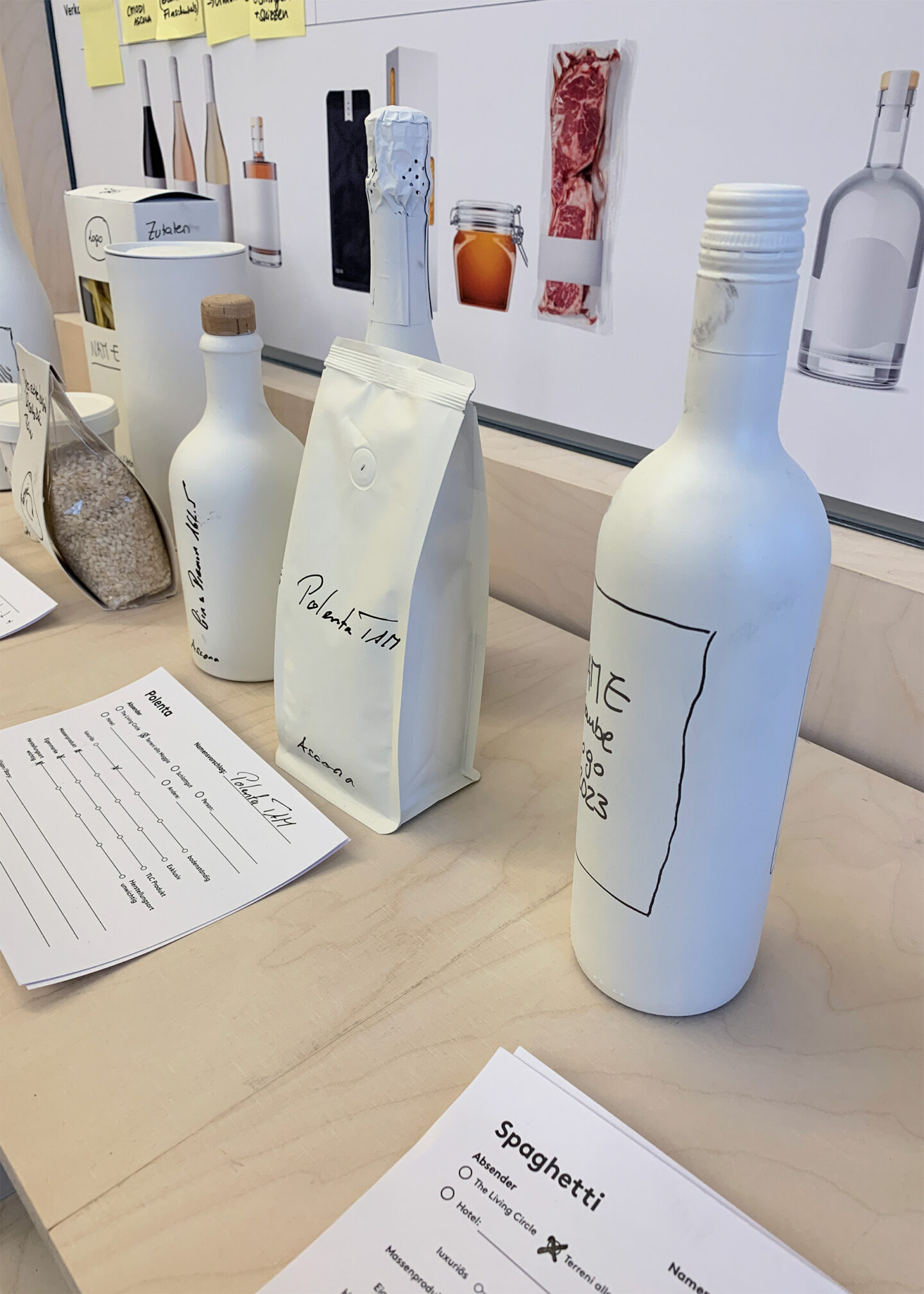
During the exploration phase, numerous design approaches were developed, which were discussed, analyzed and continuously optimized together with the project team.


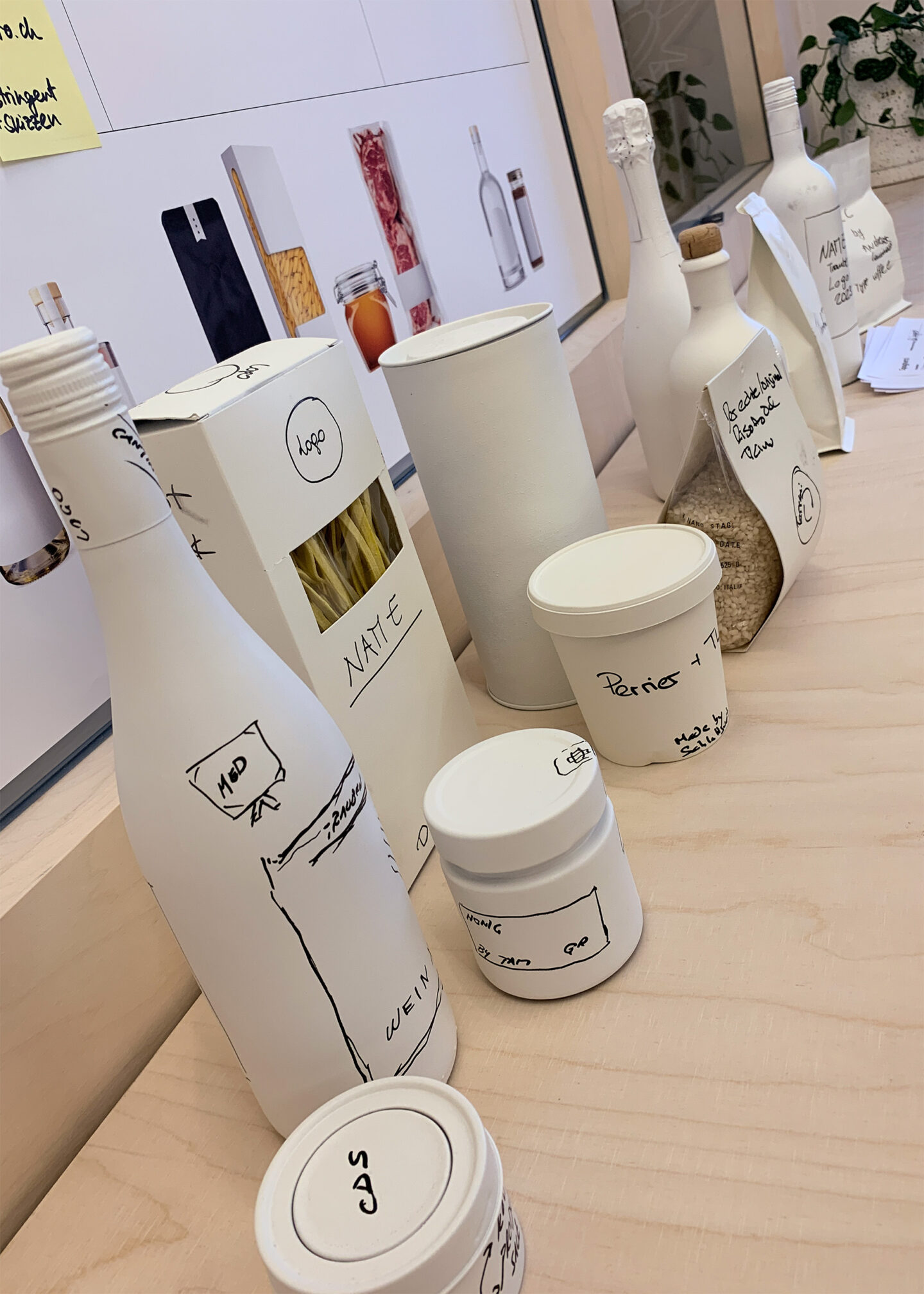
Holistic support
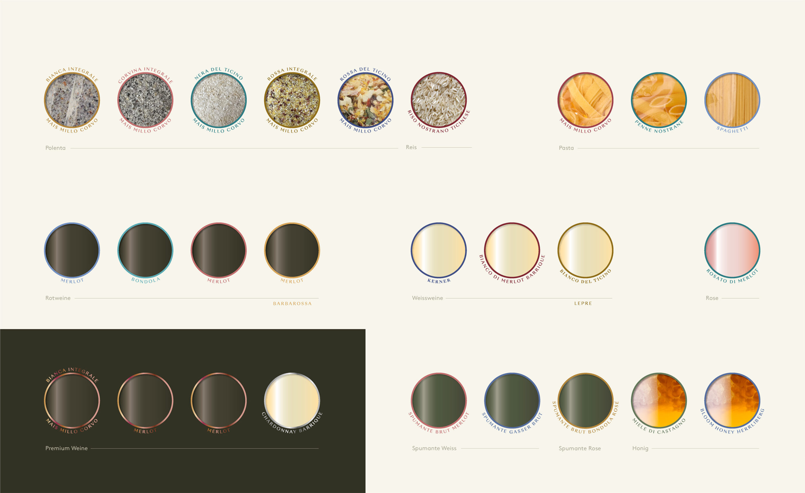
In addition to developing the design concept, we supported The Living Circle in the implementation and production of the various products. The focus was always on practicality in order to ensure smooth and efficient implementation.


And the winner is...
We are delighted that "Il Querceto" has been awarded the ExpovinArt Award 2025. The expert jury's comment:
A prime example of effective packaging design: the precisely placed cutout with golden framing creates a visual center of high recognition value. This is supported by a minimalist, deep black overall aesthetic, which creates elegance and tension through subtle graphic ray motifs. The label is modern, bold and yet true to the brand - a clear eye-catcher on the wine shelf and a statement in the premium segment.
"A bold, perfectly staged label with an iconic cutout - uncompromisingly modern and visually outstanding."